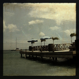
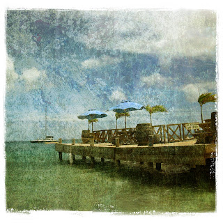
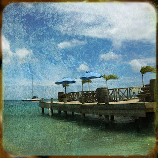
I took the same picture and manipulated it three different ways:
#1 TTV - Through the viewfinder: I added a vintage tone, added a TTV framed perspective, and multiplied my action.
 #2 - Brown paper texture: I added a simple clipping mask to the edges of the picture.
 #3 Grunge texture - I found some cool NYC street textures over at Fudgegraphics and a frame to add.
 NOW, which one do you like - if any? Leave me a note with your opinion of these three pictures!

4 comments:
I can't decide!!! I think the shadows in the first make it look very ominous! It looks like a storm is coming! And the second one looks so soft, like a fuzzy memory. I like the colors in the third, makes me wish I was there, but don't like the border for some reason. I'm no help!! lol
I told you which ones I liked. I like them all. But I have changed my mind. I like #3, then #1 and then #2. They are all so different! :)
#2 is my fave. I think it looks like an artist's portrait. The brown edges on #3 are distracting to me. I like #1, but just not as much as #2.
I like #2 the best as well, but I really do like them all! I am so glad you are taking this class-it looks so much fun!!!
Post a Comment